
.png)
Accordion
This module can help you create a section to add FAQs or large pieces of content users can toggle to show or hide. You can adjust its height according to the different devices, i.e. Mobile, Desktop, Tablet.
You are free to add, edit, delete or clone the content of accordion. Change the icon position. Align it left or right. Apply animation. Enable or disable icon shadow box. Also, you can put the accordion content in one or two columns.
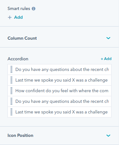
We have provided four options in the style section of this module:
- Title: Overwrite the font, uppercase, lowercase, capitalize the content. Change background color, spacing, padding of the title.
- Content: Change the background color, color and spacing for the content.
- Icon: Overwrite the icon color.
- Accordions: Change the border style-solid, dotted, dashed or doubled. Also, change the spacing between accordions. Enable or disable the max-width and set a particular value for it. Choose the corner radius for the accordion corners.
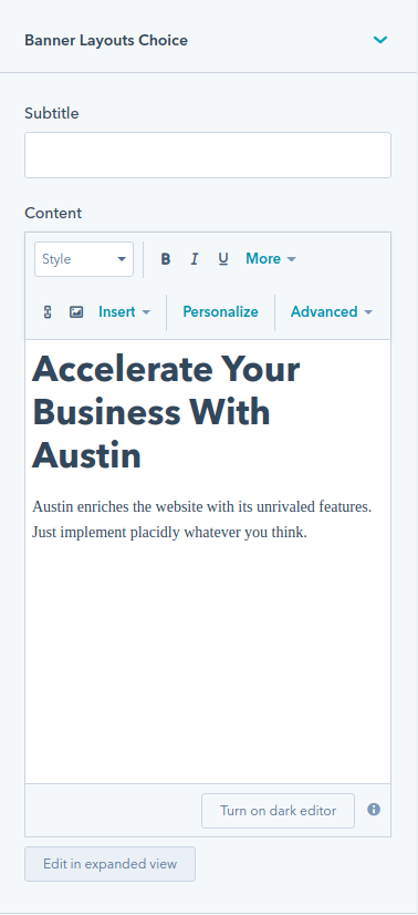
Banner Layouts
Banner layout module provides you different layouts of banner like banner with background color,banner with background image,banner slider,video banner and banner with imaage or form. You can use it to create the first fold section of your website’s homepage or any landing page. You can tweak banner heading, subheading, banner content, and many other things in this module.
Add primary or secondary CTA. Within primary CTA and secondary CTA, we have provided several options.For instance-
- Type- Choose button, HubSpot CTA, or none.
- Style- Choose filled(dark), outline(dark), arrow(dark), filled(light), outline(light), arrow(light).
- Text- Provide content for text.
- Link- Link to external, content, file, email address, blog. Provide URL/open link in a new window. Enable or disable link type as no follow.
Similarly, you will have these alternatives for Secondary CTA.
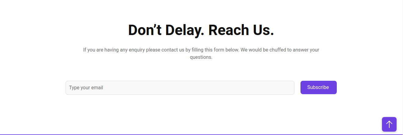
Austin banner layouts provides the feasibility to enable or disable the background overlay,content color,alignment of banner content,spacing and content maximum width.
Button
This module helps you add a button in your page. You can customize the styling of this button like set border radius, enable/disable shadow, change text color,border color and more.
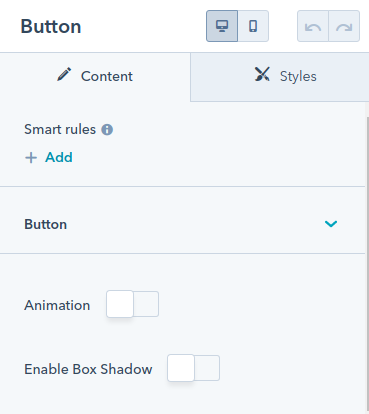
It also provides feasibility to align the button in desktop and mobile as per your requirement.
Card
This module adds a section where you can display multiple cards. It provides two types of layouts:-
- Card Layout:-
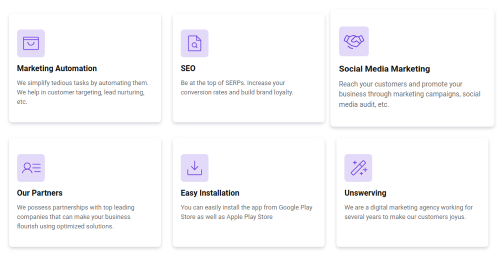
- Compact Layout:-
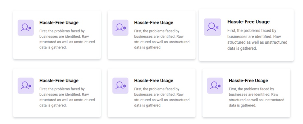
Each of these cards has an icon,heading and content. You can set the number of cards you want to display in a column. You can also change the layout,the text alignment,background color and icon color of these cards.
Countdown
This module helps you add a countdown timer on your page. You can select a date and time you want to run the countdown for.Specify the countdown labels- days, hours, minutes, and seconds in your countdown timer. Enable or disable the positioning of the countdown label at bottom.
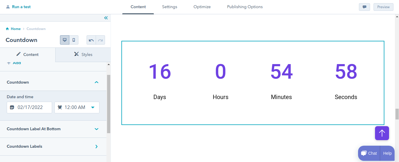
You can choose the font, font style, font size, and font color of the countdown timer and it's label for desktop. Vary the font size of it for mobile.
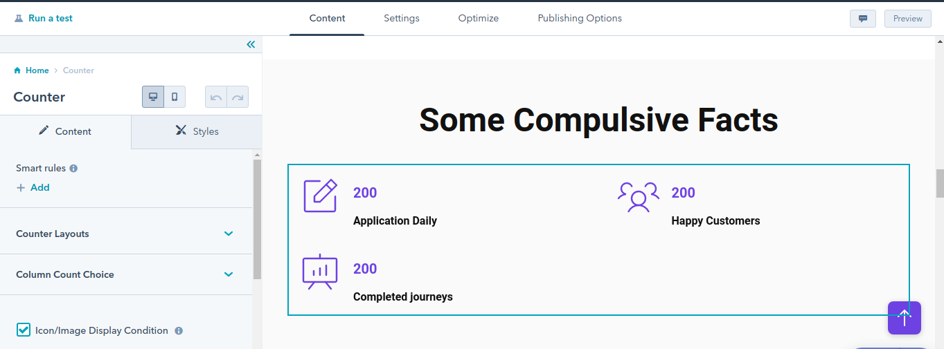
Counter
This module creates a section that contains multiple columns. Each of these columns has some content and a counter with it. You can use it in your about us page, or home page to display the numbers like businesses you’ve helped, number of clients, countries you offer solutions to.
We have given two options for counter layout choice-
- Card Layout
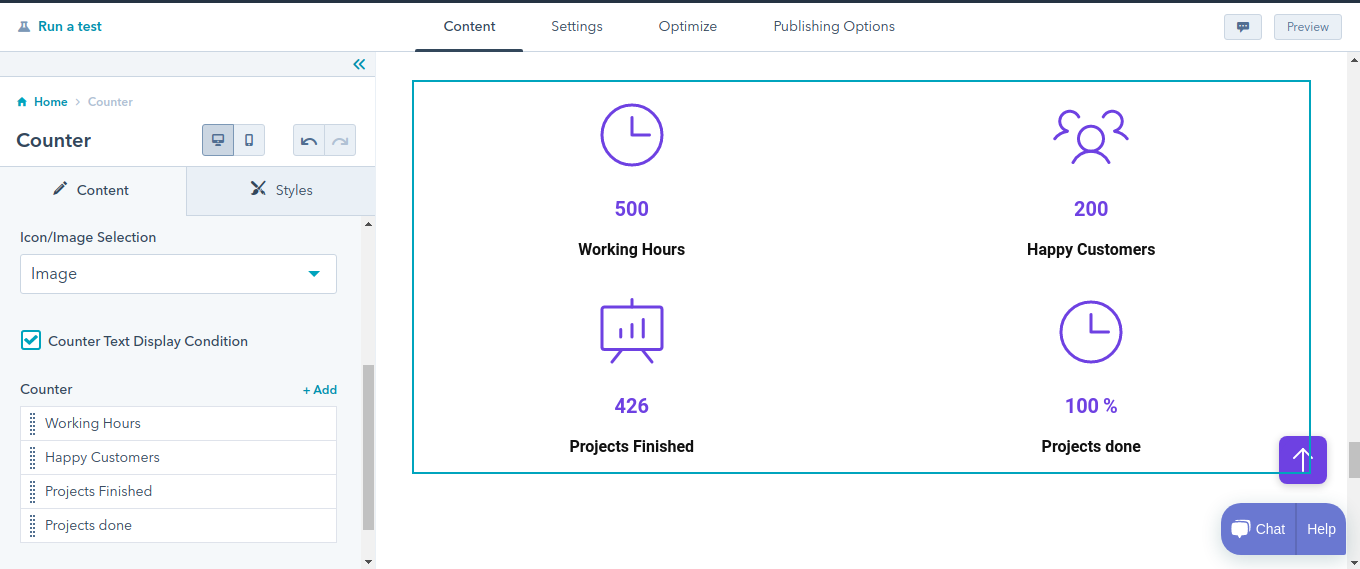
- Compact Layout
For both card layout and compact layout choose:
- Two Column
- Three Column
- Four Column
Also, select the image/icon in the counter component. Enable or disable the display of images/icons in it.
Change the font, font style, font color, and font size of counter value for desktop. Change the font, font style, and font radius of counter text for desktop. Set font size of counter text and counter value for mobile.
Align counter content either left, right, or center separately for mobile and desktop.
Set the margins and padding for counter spacing separately for mobile and desktop.
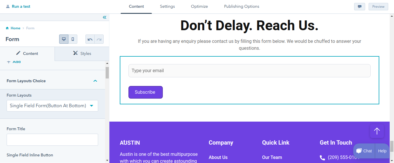
Form
With the Form module, you can add a form on your pages. You can drag and drop this module and the form will be created on the page. Then you need to select the form, add fields if you want to, set a thank you message, redirection and you’ll be done. You can also set GDPR options, captcha in the form.
We have provided three options for form layouts:
- Single Field Form(Side Button)
- Multiple Field Form
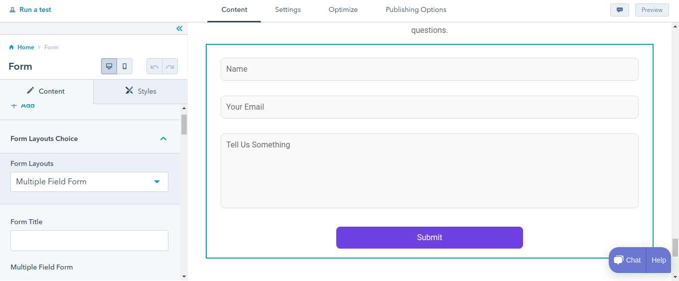
- Single Field Form(Button At Bottom)
In Form editor provide Button text. Choose GDPR options. Enable or disable the CAPTCHA. Show Thank You option for form submitting. With the help of form automation, create contacts with their email address. Manage the workflows. Thank You Setting will apply to the Form Page only.
Also, you can enable/disable Form Box Shadow and Field Box Shadow. For each, decide the shades. Edit, clone or delete the shadows.
Enable or disable the form background color, form corners, form title color, form title border, form title alignment for desktop, and max width. Provide full width for buttons. Change the background color, border for input fields.
Header Toggler
Add Smart rules to your header toggler. We have provided two options for header toggler:
- Toggle Open
- Toggle Close
For toggle open, set the image or icon. Set Alt text, Size, Width and Height for it. Similarly you can do it to toggle close.
Here is an instance of toggle open and toggle close.
Set the margin and padding for your header toggler.
Header Controls
Provide Header-controls for user’s flexibility. Enable or disable phone, language switcher, search, button options.
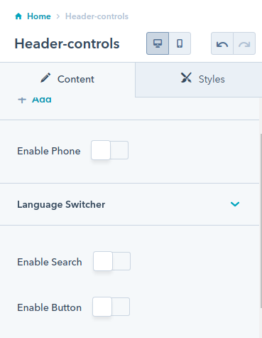
For button, we have provided several options type,style, text, etc. as shown in the images.
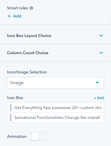
Icon Box
Choose the compact or card layout for the icon box. Align in one-column, two columns, or three columns. Select image/icon for the icon box. Enable/ disable the animation for it.
Edit, clean or delete the icon box content.
Enable or disable the icon background color. Opt either round, square, custom corner shape for your icon box.
Set heading and text for icon box content. Set icon box spacing separately for mobile and desktop.
Enable or disable the card background of the icon box.
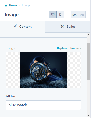
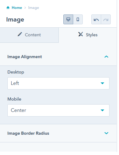
Image
As the name suggests, this module helps you add an image on your page. You can set the image of your choice and its alt text, size, loading, etc.
Align image left, right, and center separately for mobile and desktop. Enable or Disable Animation. Set image border radius.
List
We have provided two options for list type:
- Ordered List
- Unordered List
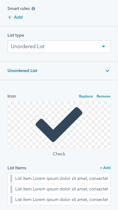
Also, you can enable/disable custom bullet points and the same icon for all list items.
In our list module, we have provided several options for our icons and list items.
Change the icon color, icon size, and icon shape for the list. Fill color in your list. Set the size for it. Set the background color, corner radius, and spacing for the list.
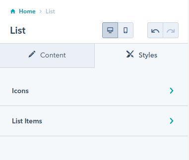
Precisely set the spacing between your icon & list, and between the list items.
Listing Layouts
There are three options for listing layouts- filter layout, card layout, and grid layout. Edit, delete or clone the tabs and listing content.
Enable or disable the enable box shadow.
Change the background color of listing layouts. Enable or disable the overwriting of title colors. Enable or disable the overwriting of title color, card border radius, card button, card border, and content text color.
Choose appropriate margin for card inner spacing.
Set text color and background color for tags of listing layout.
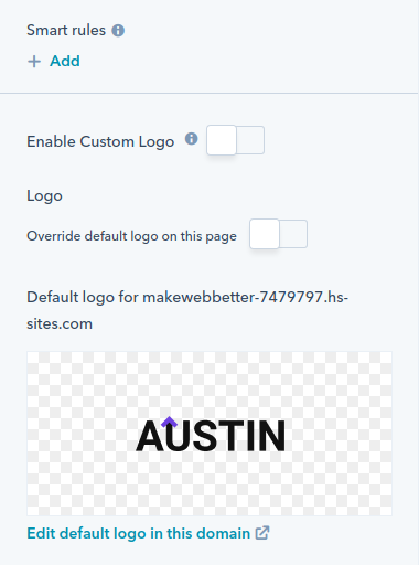
Logo
Make yourself recognized through your logo. Set image, alt text, size, maximum size, link page, URL, and link type. Enable or disable the link opening in the new window.
Show or hide the logo on breakpoint.
Map
Add a map to your website so that visitors can easily find you.
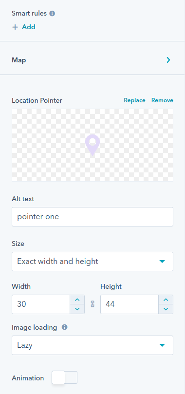
Set map center parameters such as center latitude and longitude. You are free to change its location pointer, alt text, size, width, height, and animation.
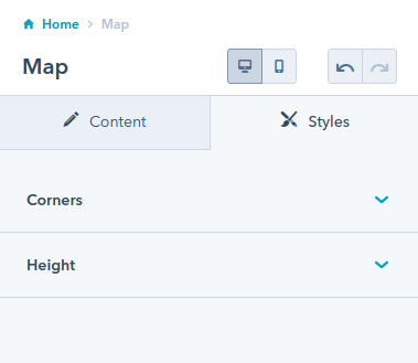
Set border radius and height separately for desktop, tab, and mobile.
Mega Menu
Edit the mega menu content- title, link, link type, URL, select column, column arrangement, and column description. Enable or disable the box shadow.
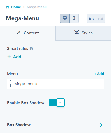
Choose appropriate width for your mega-menu. Change the color for the mega-menu icon.
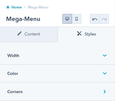
For the corners, set a particular value for the image and mega menu.
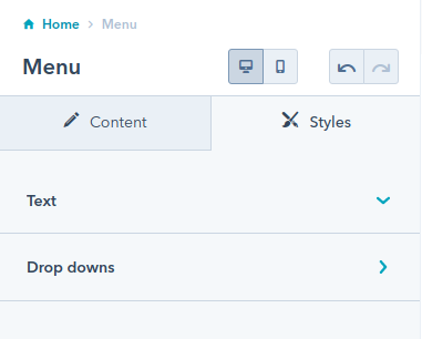
Menu
Set menu and max levels for it.
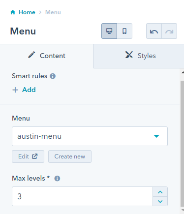
Here is an overview of the advanced menu.
Change the text color of the menu. Set the text color, background color, and border color for the dropdown of the menu.
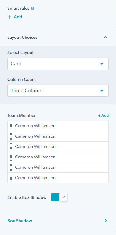
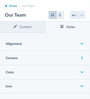
Our Team
Showcase your team members on your site flexibly. There are three options for selecting the layout- card layout, card slider layout, and slider with content layout.
Also, you can align the layout in three or four columns.
Edit the content, and enable or disable the box shadow.
For slider settings- choose specific items, enable or disable slider dots and slider navigations. Change the navigation icons.
Align the content left, center, or right. Enable or disable overwriting of the cards at corners. Change the background color of the content and icon size.
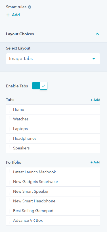
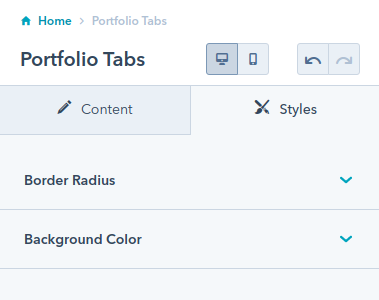
Portfolio Tabs
Choose image tabs, image slider or image with content for your portfolio tabs layout.
Enable or disable the icons and animation for portfolio tabs. Edit the tab and portfolio content.
Change the subtitle, enable or disable the overwriting of border radius, and background color for the portfolio tabs.
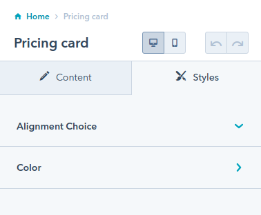
Pricing Card
Show your pricing plans in an effective manner. Choose pricing card layout either for your basic or premium plans. Enable or disable icon or image in the pricing cards. Show your time period plans. Fully edit the content of pricing cards and time period. Enable or disable box shadow and animation.
Also, align the badge on top or side.
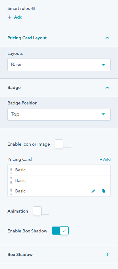
Align your pricing card left, right or center. Change the background color of the pricing card and badge, and enable or disable the overwrite of icon color.
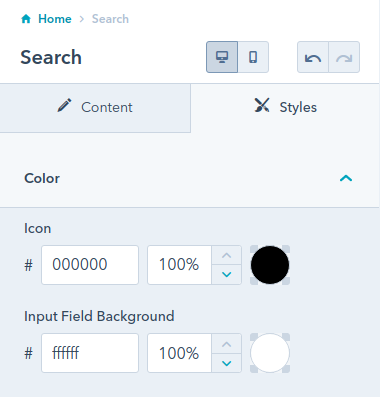
Search
Put the search bar at the top of your page. Edit the content that will appear in the placeholder. Enable or disable the box shadow.
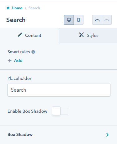
Change the icon color and input field of the search bar.
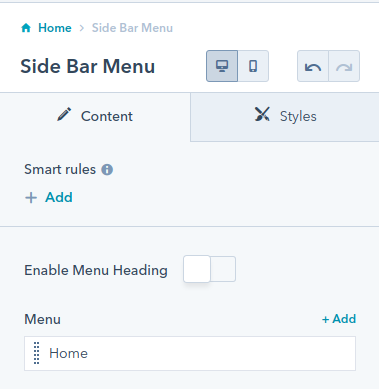
Sidebar Menu
Enable or disable the menu heading and edit the content.
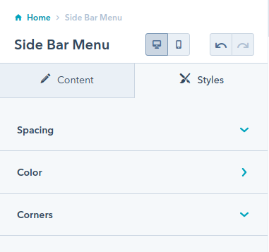
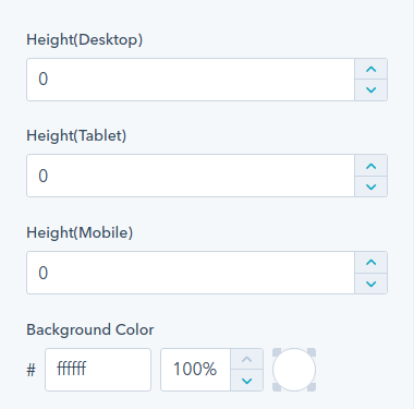
Change spacing, color, and corner spacing for the side bar menu.
Spacer
Set the spacer height separately for mobile, tablet and desktop. Also, you can change its background color.
Table Of Contents
Edit top main menu repeater and content repeater in your table of content. You can edit and clone them.
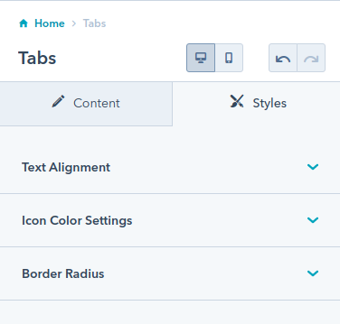
Tabs
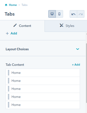
You can edit, delete or clone the tab content as well as enable or disable the animations.
Align the tab’s text right, left or center. Separately choose text alignment for mobile. Change the background color of your icons and fix the border radius if you want.
Testimonial
We have provided four alternatives for testimonials layouts:
- Single Column Slider With Image
- Two Column Slider
- Single Column Slider Without Image
- Card Layout
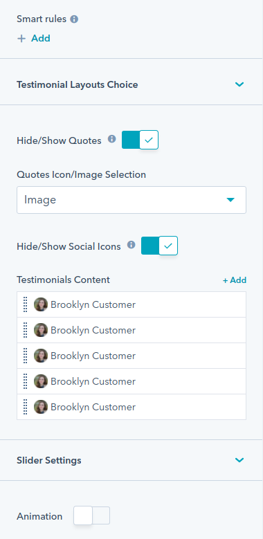
Also, you can hide/show the quotes as well as social icons. Edit, delete or clone the testimonial content.
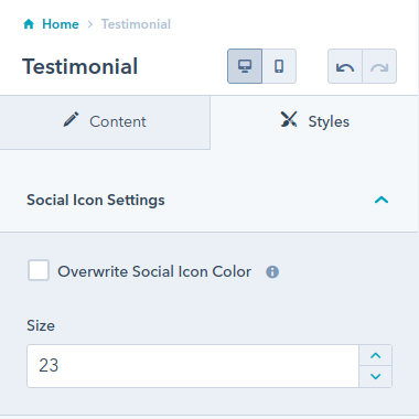
Overwrite the social icon settings and fix social icon size.
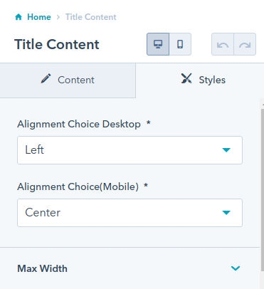
Title Content
Add subtitles and edit the content. You can add primary CTA as well as secondary CTA.
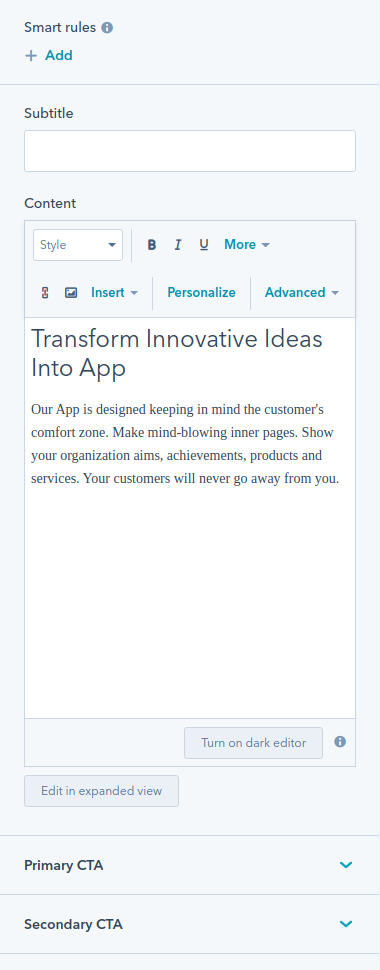
Align the title content left, right or center separately for mobile and desktops. Enable or disable the max width.
Set the margin bottom for title, subtitle and description separately for mobile and desktops.
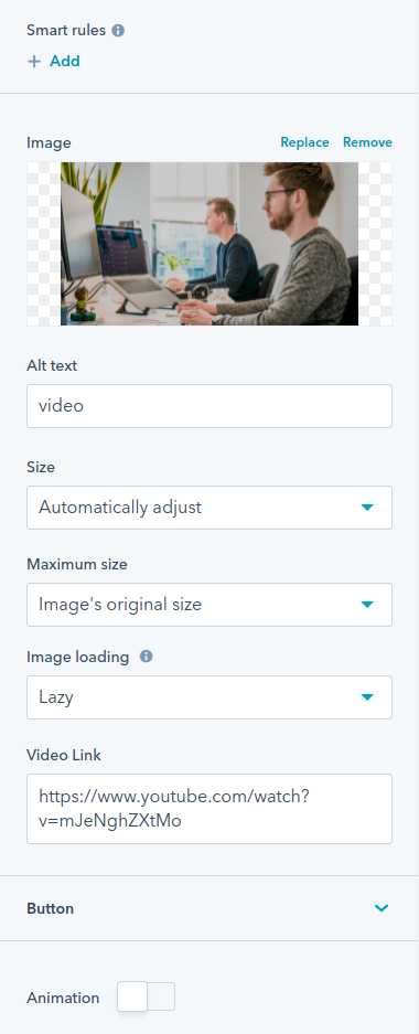
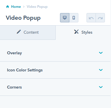
Video Popup
Add image, Alt text, Size, Maximum size, image loading, video link, and buttons. Enable or disable animations.
Enable or disable the overlay, overwrite the background color, and corners.
Social Follow
Add more smart rules to your social follow module. Fully edit your social media information on your site. Enable or disable the animation.
Enable or disable the overwriting of fill option.
Change the alignment, spacing, corner radius, enable or disable the background color, and change the size of icons.